
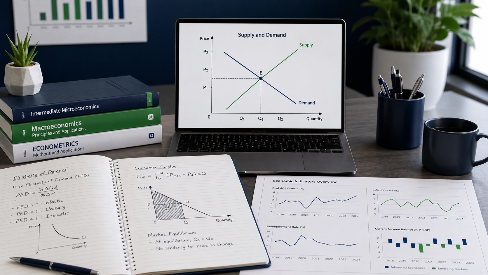
Economics Assignment Help With Graphs and Data Interpretation
Most economics assignments are not really testing whether you can memorise a definition. They are testing whether you can read a diagram, pull meaning from a dataset, and explain what the numbers actually say. That is where students lose the most marks, and it is exactly where clear guidance makes the difference.
This guide walks through the graphs, statistical tools, and interpretation techniques that show up again and again in micro, macro, and applied economics coursework. It is built to help you understand the reasoning, not just copy an answer, so your next submission reads like the work of someone who genuinely gets it.
Why Graphs and Data Interpretation Trip Students Up
Economics sits at an awkward crossroads. It is part social science, part mathematics, and part written argument. A single assignment might ask you to draw a supply and demand diagram, calculate a price elasticity, interpret a regression output, and then write two pages explaining what it all means for consumers or policymakers. Each of those skills is different, and a weakness in any one of them shows up in your grade.
The reason economics assignment help so often centres on graphs and data interpretation is simple: these are the parts that cannot be bluffed. You can paraphrase a textbook definition of inflation, but you cannot fake a correctly shifted aggregate demand curve or a sensible reading of a scatter plot. Markers know this, which is why so many marks are attached to visual and quantitative reasoning.
There are three recurring problems students face. The first is mechanical: drawing diagrams that are accurate, correctly labelled, and consistent with the scenario. The second is analytical: understanding what a shift, a slope, or a coefficient actually implies. The third is communicative: writing about the graph or dataset in a way that connects it back to the question. Master all three and you move from a passing answer to a strong one.
The Core Diagrams Every Economics Student Must Master
Before you can interpret anything, you need fluency with the standard toolkit of diagrams. These appear across almost every economics module, and examiners expect them to be second nature.
Supply and Demand
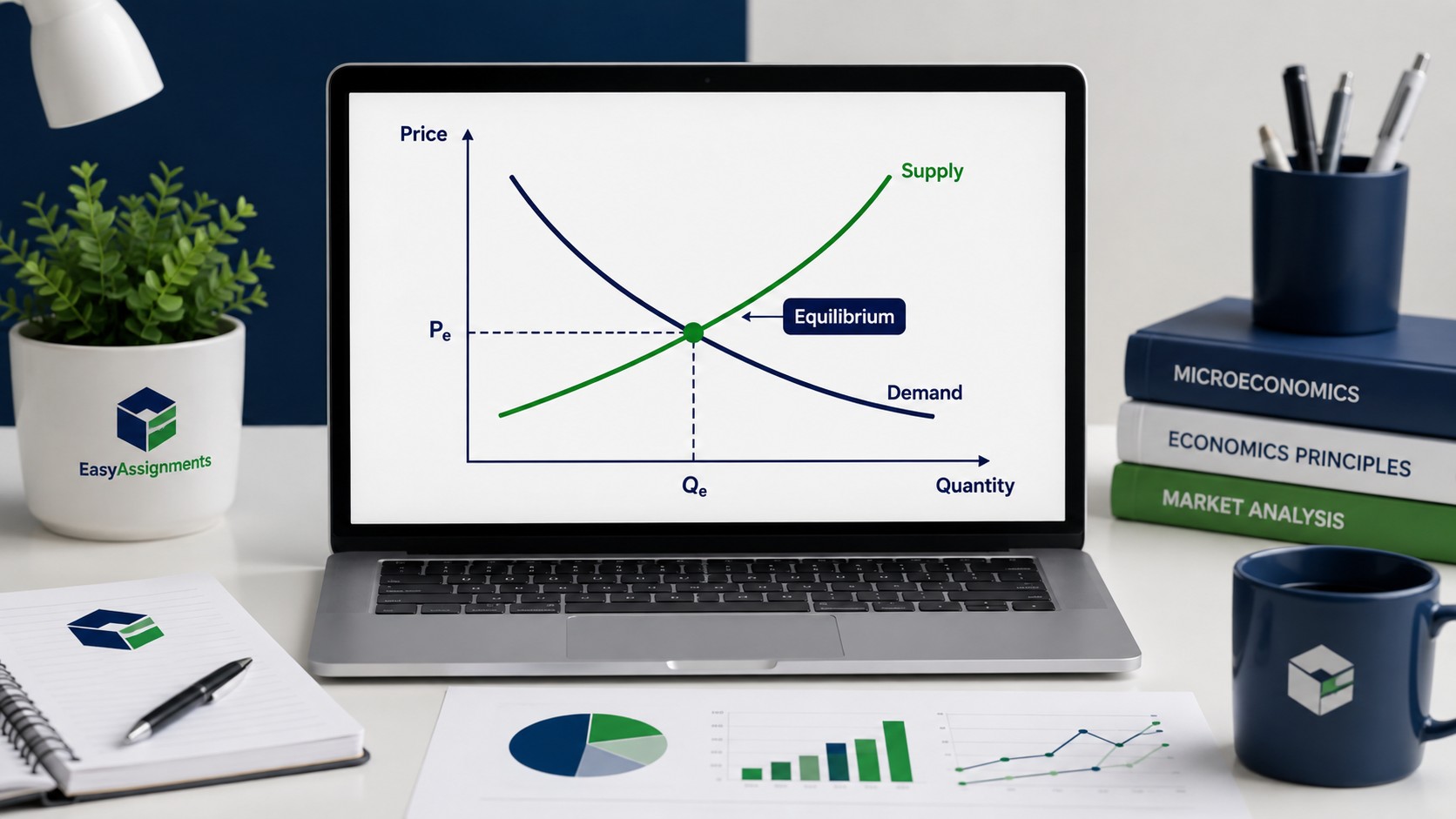
The supply and demand model is the backbone of microeconomics. The demand curve slopes downward because consumers buy more as prices fall, and the supply curve slopes upward because producers supply more as prices rise. Equilibrium sits where they cross, at the price and quantity where the market clears.
The real skill is not drawing the curves, it is knowing what moves them. A change in price causes movement along a curve. A change in an external factor, such as income, tastes, input costs, or the price of related goods, shifts the entire curve. Confusing a movement along the curve with a shift of the curve is one of the most common and costly mistakes in first-year economics.
Elasticity
Elasticity measures how responsive one variable is to a change in another. Price elasticity of demand tells you how much quantity demanded changes when price changes. A steep demand curve suggests inelastic demand, where quantity barely moves. A flat curve suggests elastic demand, where quantity is highly sensitive. Understanding the shape of the curve is inseparable from interpreting the number.
Cost and Production Curves
In the theory of the firm you will meet marginal cost, average total cost, average variable cost, and marginal revenue. The relationships between them matter more than any single curve. Marginal cost always cuts average cost at its lowest point. A firm maximises profit where marginal revenue equals marginal cost. Knowing why these intersections matter is far more valuable than memorising their shapes.
Macroeconomic Models
On the macro side you will work with aggregate demand and aggregate supply, the production possibility frontier, the circular flow of income, and models such as IS-LM in more advanced courses. These diagrams tie whole economies together, so a small labelling error can cascade into a completely wrong conclusion about growth, inflation, or unemployment.
Quick rule of thumb: before you write a single sentence about a diagram, check three things. Are both axes labelled with the correct variables and units? Is every curve clearly named? Does the direction of any shift match the scenario in the question? Fixing these three basics recovers marks in nearly every economics assignment.
How to Read and Interpret Economic Graphs
Interpretation is where good students separate themselves. A diagram is only worth marks if you can explain what it shows. Here is a reliable method you can apply to almost any economic graph.
Start by identifying the variables on each axis and the units they are measured in. It sounds obvious, but many misreadings begin with confusing a percentage change with an absolute level, or real values with nominal ones. Next, describe the overall shape and direction. Is the line rising, falling, or flat? Is the relationship linear or curved? Then look for turning points, intersections, and gaps, because these are usually where the economically interesting events happen.
Once you have described the graph, move to explanation. Why does the curve behave this way? What economic logic drives the relationship? Finally, connect it to the question. If you are asked about the effect of a subsidy, your interpretation should end with a clear statement about price, quantity, consumer surplus, or welfare, not just a description of lines on a page.
Common Graph Types and What They Signal
- Line graphs usually show trends over time, such as GDP growth or inflation. Focus on the direction, the steepness, and any sudden breaks.
- Bar charts compare categories, such as unemployment across countries. Look for the largest and smallest values and the gaps between them.
- Scatter plots reveal relationships between two variables. Look for whether points cluster along an upward or downward pattern, and how tightly they cluster.
- Pie charts show composition, such as the share of government spending by department. They are best for proportions, not for trends.
- Curve diagrams, like supply and demand, model theoretical relationships rather than real data, so interpretation focuses on shifts and equilibria.
Watch out: correlation is not causation. A scatter plot may show two variables moving together, but that does not prove one causes the other. Strong economics answers acknowledge alternative explanations, omitted variables, and the direction of causality rather than jumping straight to a confident causal claim.
Working With Real Economic Data
Beyond textbook diagrams, many assignments hand you a dataset and ask you to make sense of it. This might be a table of inflation figures, a spreadsheet of household spending, or the output from a statistical package. Data interpretation is a distinct skill, and it rewards a calm, systematic approach.
The first step is always to understand what you are looking at. Read the column headings, note the units, check the time period, and identify the source. Then look at the big picture before the detail. What is the general trend? Are values rising, falling, or stable? Where are the outliers, and are they genuine signals or possible errors?
Key Calculations You Will Often Need
Several calculations come up repeatedly in economics coursework, and knowing them cold saves enormous time.
- Percentage change, used for growth rates, inflation, and comparing figures across years.
- Index numbers, which rebase a series to a common starting point so different series can be compared fairly.
- Real versus nominal adjustments, which strip out the effect of inflation to reveal genuine changes in value.
- Averages and measures of spread, such as the mean, median, and standard deviation, which summarise a dataset.
- Elasticities, calculated as the ratio of two percentage changes, which quantify responsiveness.
| Tool or Concept | What It Measures | Where It Appears | Common Mistake |
|---|---|---|---|
| Price elasticity | Responsiveness of quantity to price | Micro, firm pricing, tax incidence | Ignoring the sign or confusing steep with elastic |
| Percentage change | Growth between two values | Inflation, GDP, revenue | Using the wrong base value |
| Real vs nominal | Value adjusted for inflation | Wages, GDP, spending | Comparing nominal figures directly |
| Correlation | Strength of a linear relationship | Applied and empirical work | Treating correlation as causation |
| Regression coefficient | Effect of one variable on another | Econometrics, dissertations | Ignoring statistical significance |
Stuck on a Graph or Dataset?
Send us the question, the data, and the deadline. We will help you understand the diagram or output step by step, so the analysis in your assignment is genuinely yours.
Understanding Statistical and Econometric Output
In later years and at postgraduate level, economics assignments often move beyond simple charts into regression analysis and econometrics. This is where many students feel most out of their depth, because software produces a wall of numbers with little explanation of what matters.
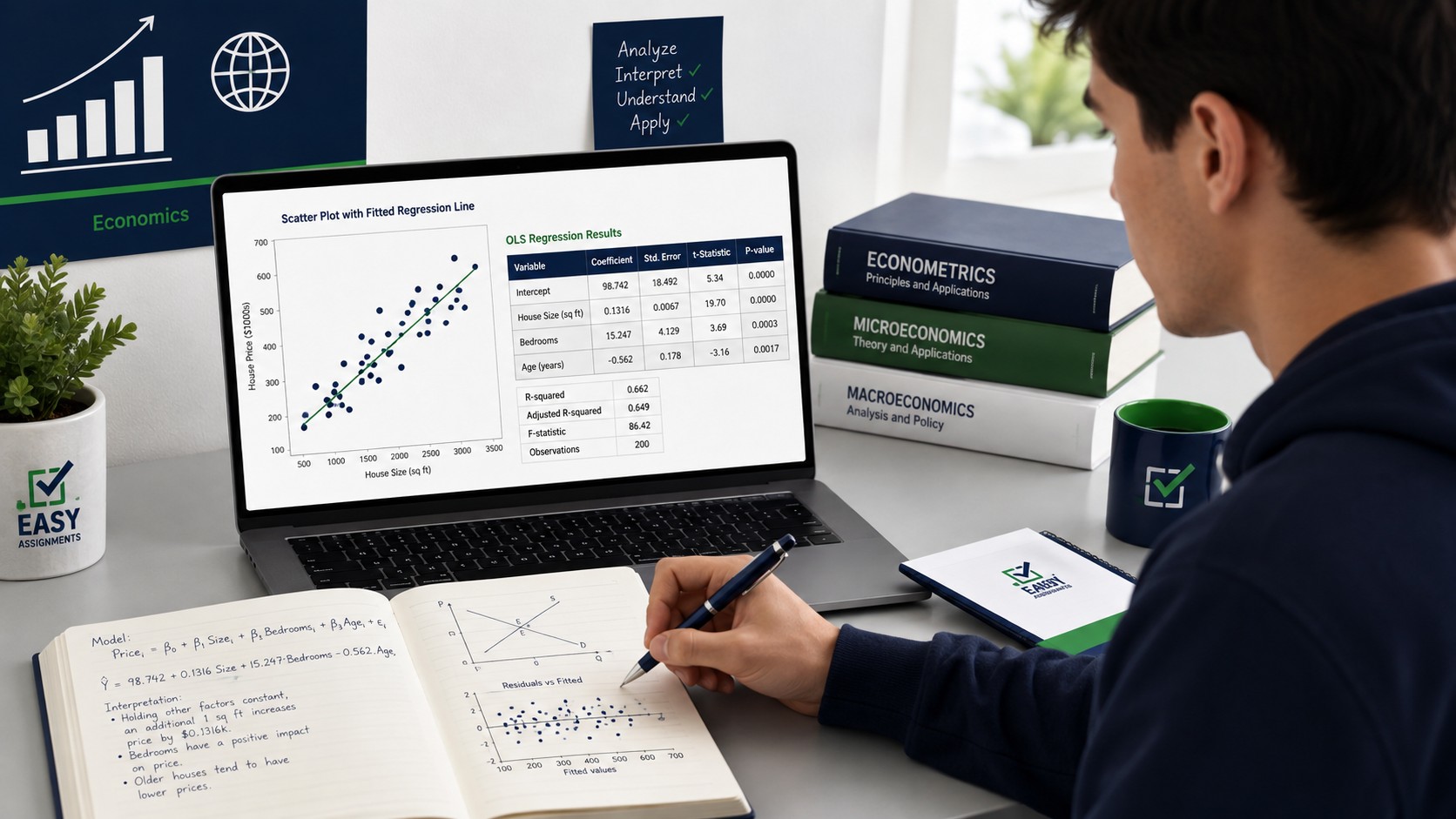
A regression tries to explain one variable using one or more others. The output gives you coefficients, which show the estimated effect of each explanatory variable, and measures of confidence, which show how reliable those estimates are. When you interpret a regression, focus on three questions. What is the direction of each effect, positive or negative? How large is it in practical terms? And is it statistically significant, meaning unlikely to be the result of chance?
The R-squared value tells you how much of the variation in the outcome your model explains, but a high R-squared is not automatically good, and a low one is not automatically bad. Context matters. A well-specified model with modest explanatory power can be far more useful than an overfitted one that explains almost everything but predicts nothing.
Interpreting a Coefficient in Plain Language
Suppose a regression estimates that a one unit increase in a variable is associated with a two unit increase in another, and that this result is significant. The interpretation is not that one causes the other. It is that, holding other measured factors constant, the data show an association of that size and direction, which appears unlikely to be pure chance. Careful wording like this is exactly what separates a confident economics answer from a sloppy one.
Turning Interpretation Into Strong Written Analysis
The final and most under-practised skill is writing. A perfect diagram and a flawless calculation still lose marks if the surrounding paragraphs are vague. Economics writing has its own rhythm, and once you learn it, your assignments become much easier to structure.
A reliable pattern is point, evidence, explanation, and link. State a claim, support it with the graph or data, explain the economic mechanism behind it, then link it back to the question. This keeps every paragraph tied to the diagram or dataset rather than drifting into unsupported opinion. Use precise economic vocabulary, but do not hide behind jargon. If you can explain a concept in plain language and then attach the correct term, you demonstrate genuine understanding.
Always quantify where you can. Instead of writing that prices rose sharply, state the size of the change and reference the figure. Instead of saying demand is responsive, give the elasticity and explain what it implies. Markers reward specificity, and specificity comes directly from careful reading of your own graphs and data.
How EasyAssignments Supports Economics Students
EasyAssignments approaches economics assignment help as a teaching exercise, not a shortcut. The goal is for you to hand in work you understand and can defend, especially the graphs and data interpretation that carry the most marks.
Diagram Guidance
Support with drawing, labelling, and explaining micro and macro diagrams so they match the scenario in your question.
Data Interpretation
Help reading tables, charts, and statistical output, with clear explanations of what each figure actually means.
Calculation Checks
Walkthroughs of elasticities, percentage changes, index numbers, and real versus nominal adjustments.
Written Analysis
Feedback on structure and argument so your interpretation reads clearly and connects back to the question.
Who We Help
- First-year students building fluency with supply and demand and elasticity.
- Intermediate students working through cost curves, market structures, and macro models.
- Final-year and postgraduate students tackling econometrics, regression, and data-heavy dissertations.
- Anyone who understands the theory but freezes when a dataset or diagram appears in the question.
The principle we work by: you should leave every assignment understanding your own graphs and data better than when you started. Support that only produces an answer, without building your ability to read the next one, is not real help.
A Practical Workflow for Your Next Assignment
When your next economics task lands, resist the urge to start writing immediately. Instead, follow a structured sequence that turns a daunting question into a series of manageable steps.
- Read the question twice and highlight exactly what is being asked, including whether it wants a diagram, a calculation, an interpretation, or all three.
- Identify the relevant model or dataset before touching a single sentence of prose.
- Draw or reproduce the diagram carefully, labelling every axis and curve.
- Perform any calculations and double-check the base values and units.
- Write your interpretation using the point, evidence, explanation, link structure.
- Review the whole answer to confirm every claim is supported by a graph, a figure, or a clear economic mechanism.
This workflow feels slow the first few times, but it quickly becomes automatic, and it consistently produces cleaner, higher-scoring answers than diving straight into writing.
Frequently Asked Questions
Do I really need economics assignment help with graphs and data interpretation, or should I just learn it alone?
Learning it yourself is the ideal outcome, and good support is designed to get you there faster. The value of guidance is that it targets the exact step where you are stuck, whether that is a mislabelled diagram or a misread coefficient, so you build the skill rather than repeating the same mistake.
How do I know if a curve should shift or if I should move along it?
Ask what changed. If the price of the good itself changed, you move along the curve. If anything else changed, such as income, tastes, input costs, or the price of a related good, the whole curve shifts. This single distinction resolves the majority of supply and demand errors.
What is the most common mistake in data interpretation?
Treating correlation as causation. Two variables moving together does not prove that one causes the other. Strong answers consider omitted variables, the direction of causality, and alternative explanations before making any causal claim.
Can you help with econometrics and regression output, not just basic charts?
Yes. Support covers everything from introductory supply and demand diagrams to regression interpretation, including coefficients, significance, and R-squared. You can send the specific output you are struggling with and get a clear, plain-language explanation of what it means.
Master the Graphs and Data, Not Just the Grade
Get clear, step by step economics assignment help that leaves you understanding your own diagrams and datasets. Share your question and deadline, and we will guide you through the reasoning.