
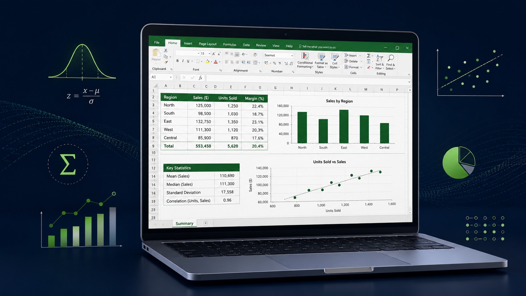
Business Statistics Assignment Help With Excel, Step by Step
If a business statistics assignment has you staring at a spreadsheet full of numbers with no idea where to begin, you are not alone. Excel already contains almost everything you need to complete descriptive statistics, charts, hypothesis tests, and regression, and this guide shows you how to use it the right way, one step at a time.
By the end, you will know which functions to type, how to switch on the Data Analysis ToolPak, and how to turn raw data into results you can defend in your write-up. When you want a second pair of eyes, EasyAssignments is here to help.
Why Excel Is Perfect for a Business Statistics Assignment
Business statistics assignment help with Excel is one of the most searched-for study needs among management, finance, marketing, and economics students, and for good reason. Excel is already installed on most university computers, it is free through many student licences, and it handles the vast majority of undergraduate and early postgraduate statistics tasks without any extra software. You do not need SPSS, R, or a paid tool to earn strong marks on a typical course.
The trick is knowing that Excel has two layers of statistical power. The first layer is its built-in functions, formulas such as AVERAGE, STDEV.S, and CORREL that you type directly into a cell. The second layer is the Analysis ToolPak, an add-in that produces full output tables for descriptive statistics, regression, t-tests, ANOVA, and more, all from a menu. Most students only ever use the first layer, then wonder why their assignment feels harder than it should. This guide covers both.
Before you touch a single formula, remember what your marker is really assessing. They want to see that you chose the correct technique, applied it accurately, and interpreted the result in plain business language. A perfect number with no explanation earns very little. Throughout this walkthrough, we will pair every calculation with a short note on what it means, so your write-up practically writes itself.
Quick tip: Save two versions of your file. Keep one raw, untouched copy of the original data and do all your work in a separate copy. If a formula goes wrong, you can always return to clean numbers instead of restarting the whole assignment.
Step 1: Set Up and Clean Your Dataset
Good statistics start with tidy data, and this is the step most students rush. Open your spreadsheet and make sure your data is arranged in a proper table: one variable per column, one observation per row, and a clear header in the top cell of each column. Avoid merged cells, blank rows in the middle of your data, and stray notes typed next to the numbers, because these break Excel functions and the ToolPak in confusing ways.
Next, hunt for problems that will distort your results. Look for these common issues before you calculate anything:
- Text where numbers should be, such as "1,200" typed with a stray space or a currency symbol that stops Excel treating it as a value.
- Missing values, blank cells that some functions ignore and others do not, which can quietly change your sample size.
- Duplicate rows that inflate your counts and skew averages.
- Obvious data-entry errors, such as an age of 250 or a negative price, that should be checked against the source.
To convert text-formatted numbers into real values, select the column, use Data then Text to Columns, and finish the wizard, or multiply the column by 1 in a helper column. To find duplicates, use the Data then Remove Duplicates button, but only after you are sure a repeated row is genuinely an error and not two valid observations. Once the data is clean, turn it into a proper Excel Table with Ctrl+T. Tables give you named ranges, automatic filters, and formulas that expand as you add rows, which makes everything downstream easier.
Step 2: Turn On the Analysis ToolPak
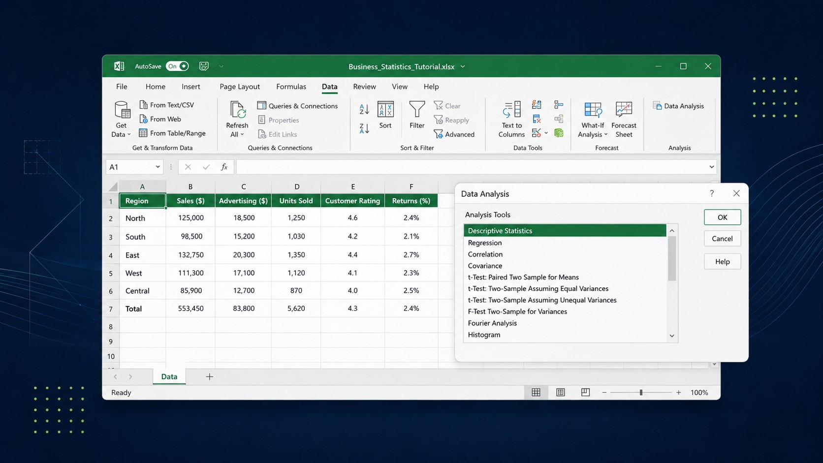
The Analysis ToolPak is the single most useful feature for a statistics assignment, and it is switched off by default, so many students never discover it. Turning it on takes less than a minute. In Excel for Windows, go to File, then Options, then Add-ins. At the bottom of the window, in the Manage box, choose Excel Add-ins and click Go. Tick Analysis ToolPak in the list and click OK. On a Mac, go to Tools, then Excel Add-ins, tick Analysis ToolPak, and click OK.
Once enabled, a new Data Analysis button appears on the far right of the Data ribbon. Clicking it opens a menu of tools including Descriptive Statistics, Histogram, Correlation, Regression, t-Test, and ANOVA. Each one asks for an input range, tells Excel where to put the results, and produces a formatted output table in seconds. This is where Excel stops feeling like a calculator and starts feeling like statistics software.
Heads up: The ToolPak produces static results. If you change your data after running a tool, the old output table will not update automatically. Rerun the analysis whenever your underlying numbers change, otherwise your write-up and your table can silently disagree.
Step 3: Run Descriptive Statistics
Descriptive statistics summarise your data with a handful of key numbers, and almost every business statistics assignment starts here. You have two routes: type individual functions, or run the ToolPak for a full table at once.
The formula route
If your data sits in cells B2 to B101, these are the core functions to know. Type each into an empty cell and press Enter:
- =AVERAGE(B2:B101) returns the mean, the arithmetic average of your values.
- =MEDIAN(B2:B101) returns the middle value, which is more reliable than the mean when your data has extreme outliers.
- =MODE.SNGL(B2:B101) returns the most frequently occurring value.
- =STDEV.S(B2:B101) returns the sample standard deviation, the usual choice for assignment data drawn from a larger population. Use STDEV.P only when your data is the entire population.
- =VAR.S(B2:B101) returns the sample variance, which is simply the standard deviation squared.
- =MIN, =MAX, and =MAX minus MIN give you the range, a quick measure of spread.
- =QUARTILE.INC(B2:B101,1) and =QUARTILE.INC(B2:B101,3) give the first and third quartiles, useful for spotting the middle half of your data.
The ToolPak route
To get all of these at once, click Data Analysis, choose Descriptive Statistics, set the input range to your column, tick Summary statistics, and click OK. Excel produces a neat table containing the mean, median, mode, standard deviation, variance, range, minimum, maximum, count, and more. Paste this table straight into your report and then explain the two or three numbers that matter most for your question. A marker loves to see that you can read a table, not just generate one.
Interpretation matters: If the mean is much larger than the median, your data is probably skewed to the right by a few high values. Saying that in your write-up shows genuine understanding and is exactly the kind of insight that lifts your grade.
Step 4: Visualise the Data With the Right Chart
Charts do two jobs in a statistics assignment: they help you understand the data, and they help your marker understand it too. The mistake students make is choosing a chart because it looks impressive rather than because it fits the data. Match the chart to the variable type.
| You want to show | Best chart | How to build it in Excel |
|---|---|---|
| Frequency of categories (e.g. product type) | Bar or column chart | Select data, Insert, then Column or Bar Chart |
| Distribution shape of one numeric variable | Histogram | Insert, then Histogram, or ToolPak Histogram tool |
| Relationship between two numeric variables | Scatter plot | Select both columns, Insert, then Scatter |
| Change over time | Line chart | Select data, Insert, then Line Chart |
| Parts of a whole (use sparingly) | Pie chart | Select data, Insert, then Pie Chart |
Whichever chart you choose, always add a clear title, label both axes with units, and remove clutter such as heavy gridlines and unnecessary legends. A scatter plot is especially valuable in business statistics because you can right-click a data point, choose Add Trendline, and tick the options to display the equation and R-squared value directly on the chart. That single move connects your visual to the regression analysis you will run next.
Stuck halfway through your dataset?
Send us your assignment brief and your Excel file. We will show you exactly which techniques fit your data and help you interpret every result correctly.
Step 5: Measure Relationships With Correlation and Regression
Many business statistics assignments ask whether two things move together: does advertising spend relate to sales, does price relate to demand, does experience relate to salary? Excel answers this in two connected ways.
Correlation
Correlation measures the strength and direction of a linear relationship between two numeric variables, on a scale from minus one to plus one. Type =CORREL(B2:B101,C2:C101), where B and C are your two variables. A result near plus one means a strong positive relationship, near minus one means a strong negative relationship, and near zero means little linear relationship. Remember the golden rule your marker wants to see: correlation does not prove causation. Two variables can move together because of a third hidden factor, so word your conclusion carefully.
Simple linear regression
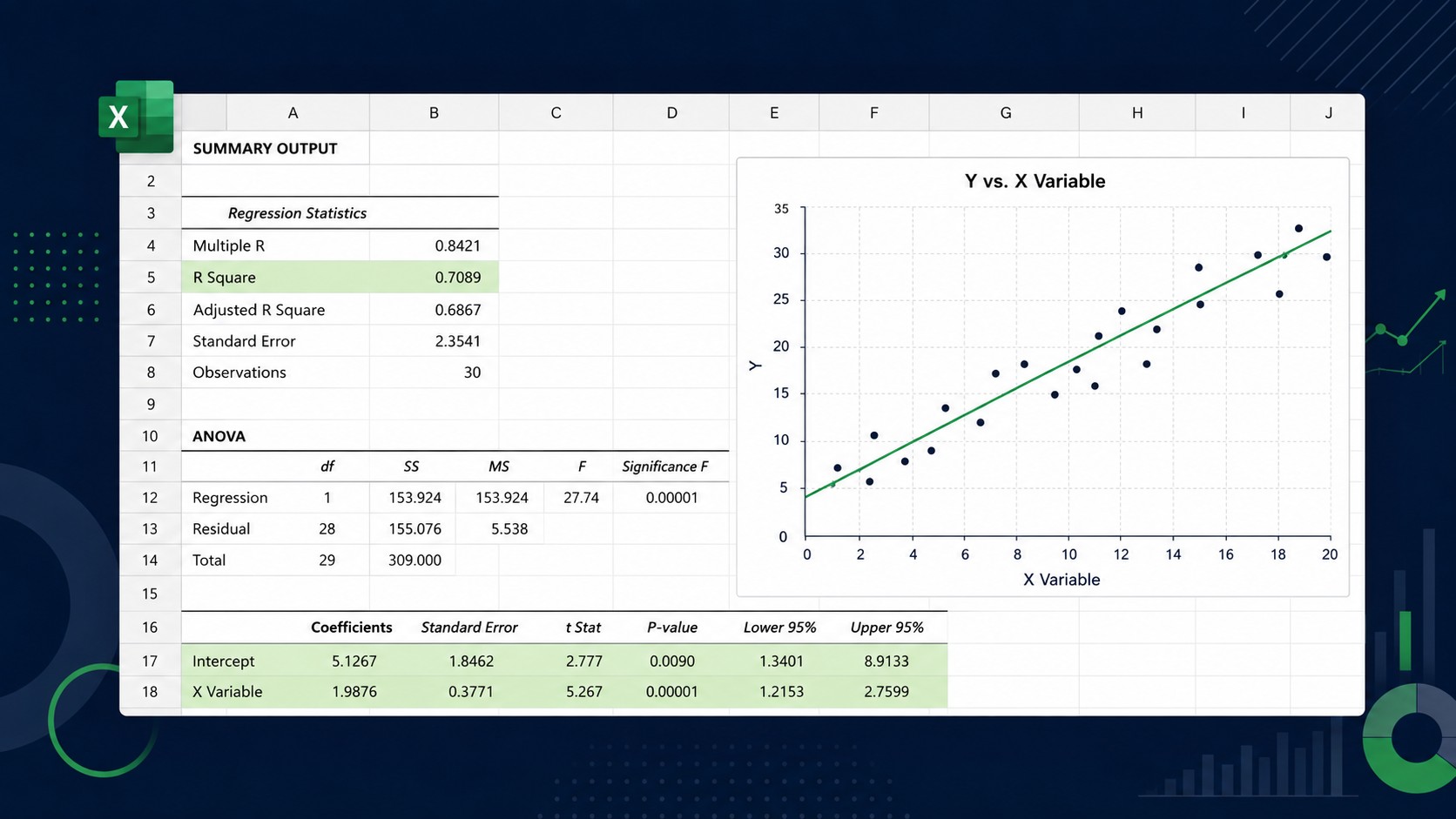
Regression goes further than correlation by producing an equation that predicts one variable from another. Click Data Analysis, choose Regression, set the Y Range to your dependent variable (the thing you are trying to explain, such as sales), and the X Range to your independent variable (the predictor, such as advertising spend). Tick Labels if your ranges include headers, then click OK.
The output looks intimidating at first, but only a few numbers matter for most assignments:
- R Square tells you the proportion of variation in Y explained by X. An R Square of 0.64 means 64 percent of the variation is explained by your model.
- The Coefficients column gives you the intercept and slope. The slope tells you how much Y changes for each one-unit increase in X.
- The Significance F and the P-value for your predictor tell you whether the relationship is statistically significant. A P-value below 0.05 is the common threshold for calling a result significant.
Turn these into a sentence such as: for every extra pound spent on advertising, predicted sales rise by the slope amount, and the model explains R Square percent of the variation in sales. That is the level of interpretation that earns marks.
Step 6: Test a Hypothesis
Hypothesis testing is where students most often lose marks, usually because they run the right test but explain it poorly. The logic is always the same. You state a null hypothesis (usually that there is no difference or no effect) and an alternative hypothesis (that there is one). You then use the data to decide whether to reject the null.
Excel and the ToolPak cover the most common tests:
- Use a t-Test (Two-Sample Assuming Unequal Variances) to compare the means of two independent groups, for example average spend by two customer segments.
- Use a t-Test (Paired Two Sample for Means) when the same subjects are measured twice, such as before and after a training programme.
- Use ANOVA: Single Factor to compare the means of three or more groups at once.
- Use the =CHISQ.TEST function or a chi-square approach for relationships between two categorical variables.
Whichever test you run, the decision rule ties back to the P-value. If the P-value is less than your significance level, usually 0.05, you reject the null hypothesis and conclude there is a statistically significant difference or relationship. If it is greater, you fail to reject the null. Always state the P-value, the decision, and the plain-English meaning together, because that combination is what markers reward.
Common trap: Failing to reject the null hypothesis does not prove the null is true. It only means your data did not provide enough evidence against it. Writing "we proved there is no difference" is a classic error that costs marks, so phrase it as "there was insufficient evidence of a difference."
Step 7: Write Up Your Results Clearly
A strong write-up follows a predictable rhythm for every technique you use. First, state what you did and why you chose it. Second, present the key output, either a small table or the two or three numbers that matter, rather than dumping every figure Excel produced. Third, interpret the result in the context of the business question. Fourth, note any limitations, such as a small sample, outliers, or the correlation-versus-causation caveat.
Format your report so it is easy to mark. Number your figures and tables, refer to them in the text, and keep your Excel formulas visible in an appendix if your brief asks for reproducibility. Consistency in decimal places, usually two, looks professional and prevents confusion. If you are new to structuring an academic report, our team can review your draft and make sure the statistics and the writing line up.
Common Excel Statistics Mistakes to Avoid
Avoiding a few predictable errors will instantly raise the quality of your assignment. Watch out for the pitfalls below.
Wrong standard deviation
Using STDEV.P when your data is a sample, not the whole population. For assignment data drawn from a larger group, STDEV.S is almost always correct.
Ignoring outliers
A single extreme value can distort your mean and regression. Spot outliers with a chart and comment on them rather than silently deleting them.
Confusing correlation and causation
A strong correlation never proves that one variable causes the other. State this clearly to show statistical maturity.
Static ToolPak output
Changing your data without rerunning the analysis leaves you with a table that no longer matches your numbers. Always rerun after edits.
When to Get Business Statistics Assignment Help
Working through Excel yourself is the best way to learn, but there are moments when a little guidance saves hours and protects your grade. If your dataset is messy and refuses to behave, if you are unsure which test the question actually calls for, or if a deadline is closing in and the interpretation just is not clicking, reaching out early is smarter than struggling in silence. EasyAssignments offers business statistics assignment help with Excel that walks you through the reasoning, not just the answer, so you understand what you hand in. You can get a free quote or talk to our support team at any time, day or night.
Frequently Asked Questions
Can I complete a business statistics assignment with Excel alone?
Yes. For the vast majority of undergraduate and early postgraduate courses, Excel with the Analysis ToolPak covers descriptive statistics, charts, correlation, regression, t-tests, and ANOVA, which is everything a typical business statistics assignment requires. You only need specialised software for advanced modelling that most courses do not reach.
Should I use STDEV.S or STDEV.P?
Use STDEV.S when your data is a sample taken from a larger population, which is the situation in nearly all assignments. Use STDEV.P only when your dataset represents the entire population you care about. Choosing the wrong one changes your standard deviation and every result that depends on it.
What does a P-value actually tell me?
The P-value estimates how likely you would see your result if the null hypothesis were true. A small P-value, usually below 0.05, suggests your result is unlikely under the null, so you reject it and call the finding statistically significant. A larger P-value means insufficient evidence to reject the null.
How do I turn on the Data Analysis ToolPak?
On Windows, go to File, Options, Add-ins, choose Excel Add-ins in the Manage box, click Go, tick Analysis ToolPak, and click OK. On a Mac, open Tools, Excel Add-ins, tick Analysis ToolPak, and click OK. A Data Analysis button then appears on the Data ribbon.
Turn Your Data Into a Confident Grade
Whether you need a full solution or just a review of your Excel work, EasyAssignments makes business statistics feel manageable. Get in touch and hand in with confidence.